Nova
Reference build
A token-driven design system that lets a 6-engineer team ship 20 dashboard screens without re-deciding spacing on every frame.
Client
Sample treasury product
Brief from
Self-initiated, to explore what a fully tokenized system requires end-to-end
Team
Solo · 2 weeks
Users
Corporate treasurers (researched via finance-platform reviews; not interviewed)
Role
Product Designer (Design Systems)
Surface
Web · Enterprise · Treasury
Duration
2026 · 2 weeks · solo build
In short
- A self-directed systems study: I built a full design system for a treasury dashboard to learn what a genuinely scalable one requires end to end.
- The core decision: a three-tier token graph (raw value to role to place-of-use), so a button is 'action/primary/bg' all the way down. Intent scales; the hex is a detail.
- The payoff: dark mode became a single token swap, and every one of the 231 tokens maps 1:1 from Figma to production CSS.
- Scale: 4 token collections, 231 tokens, 47 components, all bound to semantic tokens with no raw hex.

What it moved
The numbers, in plain sight.
4
Variable collections
231
Total tokens
47
Components
100%
Token-bound accuracy
The story · 8 chapters
How Nova got built.
rev 00brief
What the brief said.
❝One line. Redesign the treasury dashboard, make it look modern.
The users are corporate treasurers managing global liquidity. They need density, control, and a workspace that holds up at 4pm on a Friday.
When I opened the existing files, the visual problem turned out to be the smaller one.
Every screen had been hand-painted. Colours and spacing were re-decided per frame. Engineers were copy-pasting hex codes to build buttons. Dark mode was considered technically impossible.
So I rewrote the brief. Tokenised system first, dashboard second.
Pull-out · Brief
Zero
Tokens existed when I started
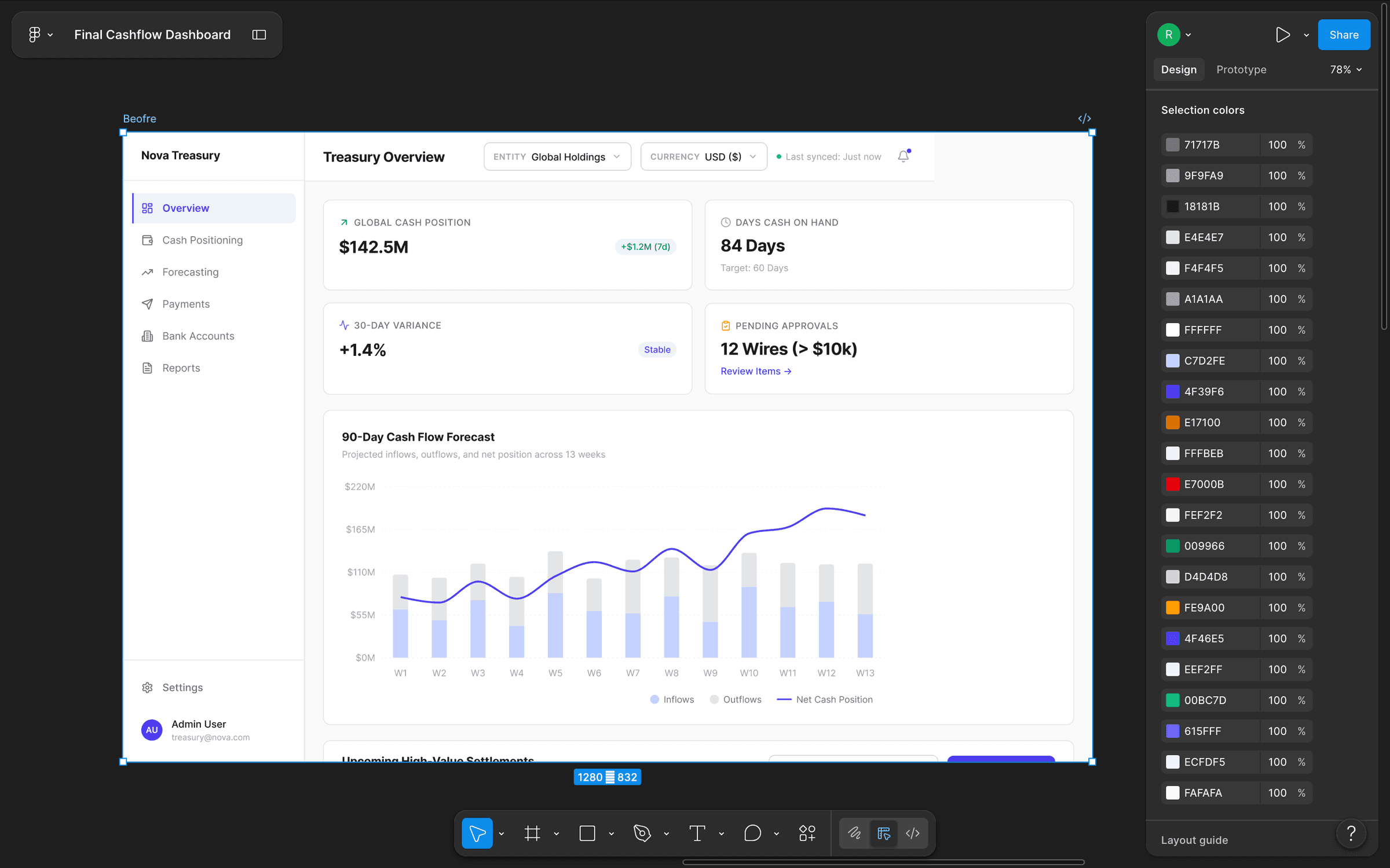
The final Cashflow Treasury dashboard inside Figma, and the long 'Selection colors' inspector beside it, the smoking gun that proved the old build had no color system at all.
rev 01investigation
What the audit found.
❝I exported every existing screen and catalogued every colour, spacing unit and component variant in use. Each one got tagged: keep, deprecate, rebuild.
There was no system. Just a folklore of remembered decisions.
The engineering code mirrored it, which was worse.
So whatever I built next had to translate cleanly into the CSS variables engineers already used, or it would become more folklore.
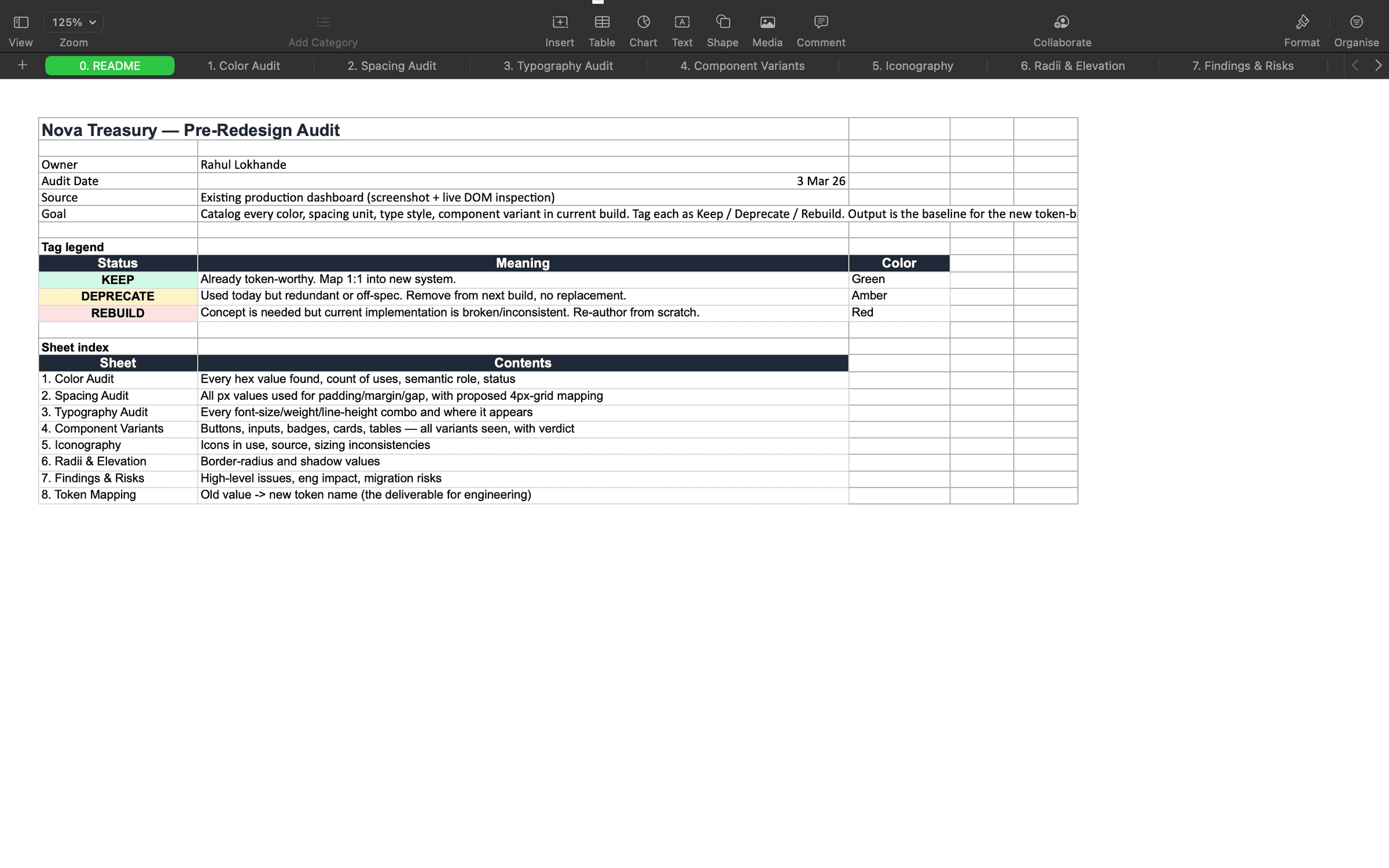
Audit README, every sheet pre-classified with a Keep / Deprecate / Rebuild status legend so stakeholders aligned on triage before any redesign work began.
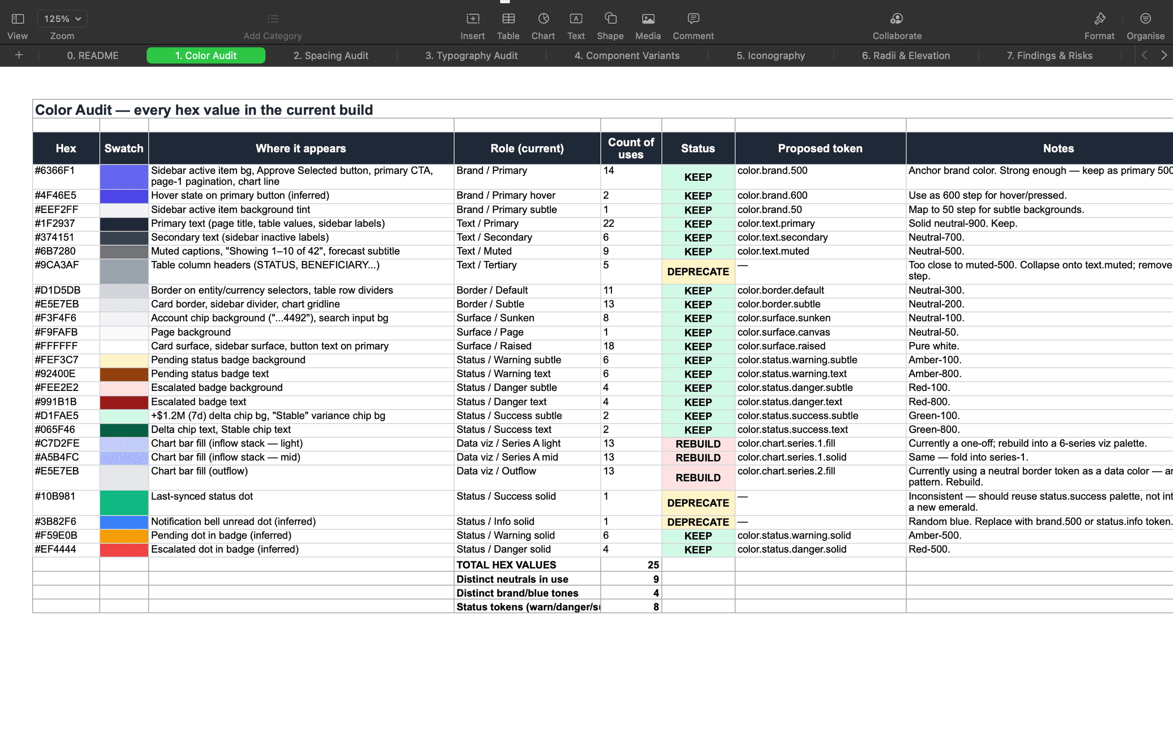
Color audit, every hex value in production logged with usage count, role, status, and a proposed semantic token, exposing duplicates and near-duplicate greys.
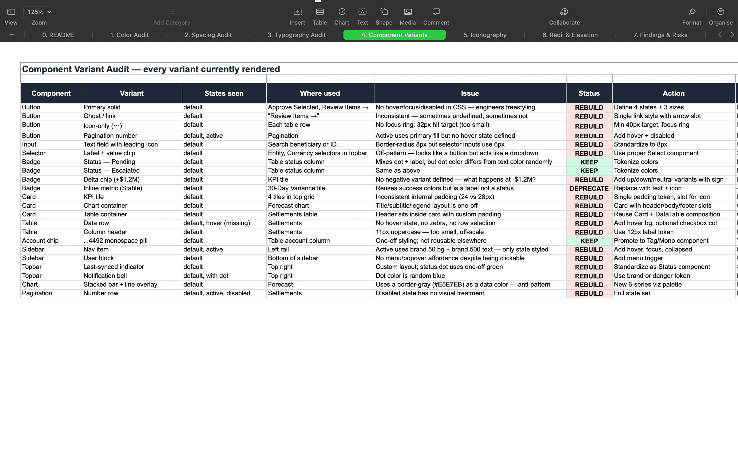
Component variant audit, every existing button, badge, table, and card variant catalogued with the specific defect that triggered a rebuild.
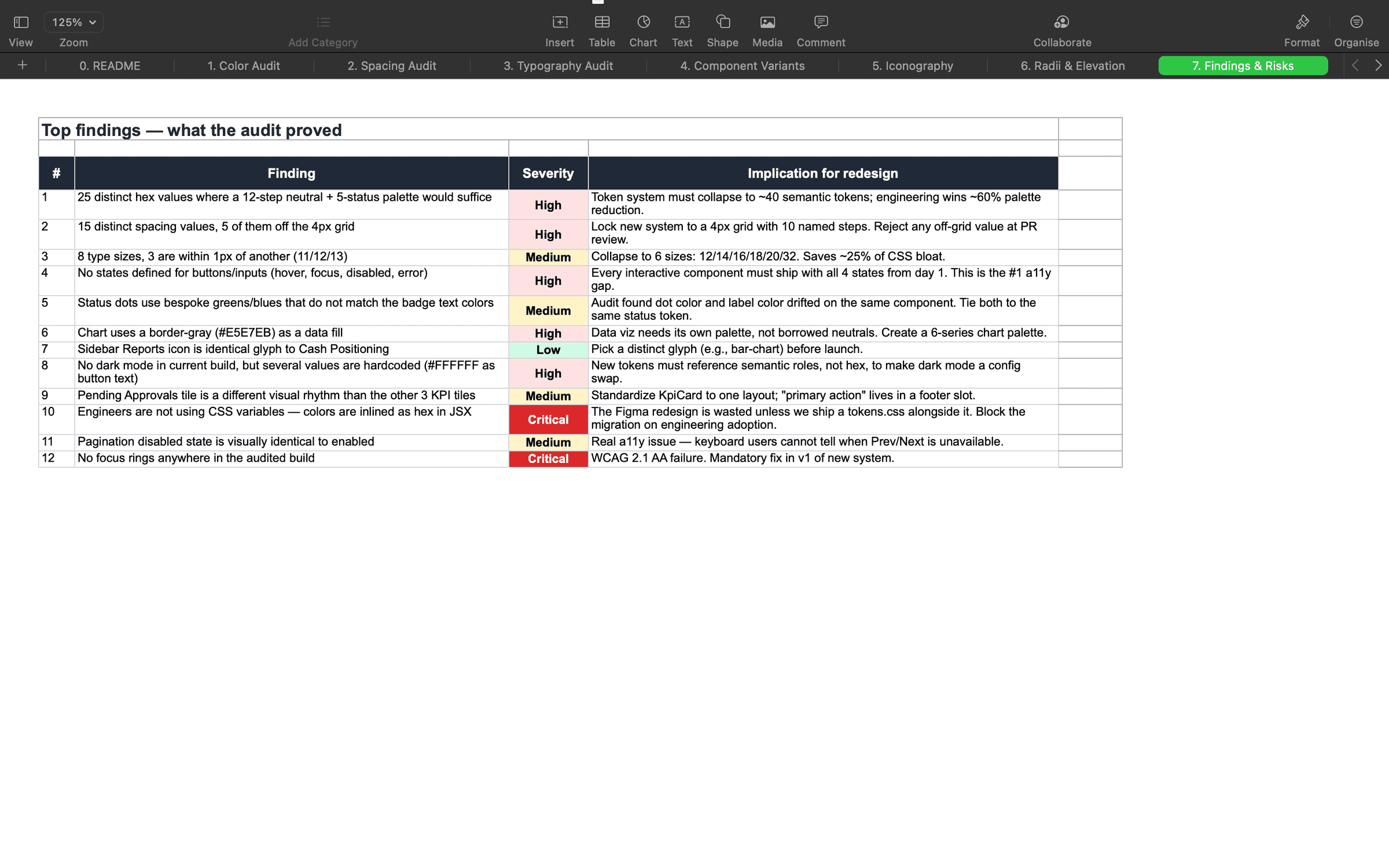
Findings & risks, the top 12 audit issues ranked by severity, each tied to a concrete implication for the new token architecture.
rev 02decision
Naming the tokens.
❝Tokens are a vocabulary. Name one badly and it costs a year.
Most systems stop at one tier. They name a blue Brand/Blue and call it done. The day the company rebrands, the system breaks.
Nova has three tiers. Primitives are the raw values. Aliases are the role a value plays: Primary, Surface, Action. Semantic tokens say where it lives, like `button/primary/bg`.
So a button is not `#4F46E5` any more. It is `action/primary/bg`. The intent scales. The hex is a detail.
That is also what made dark mode trivial. Same intent, different primitives, one flip.
Pull-out · Decision
3 tiers
Primitive → Alias → Semantic
Three-tier token graphs separate intent from implementation, so a rebrand or theme switch doesn't require touching components.
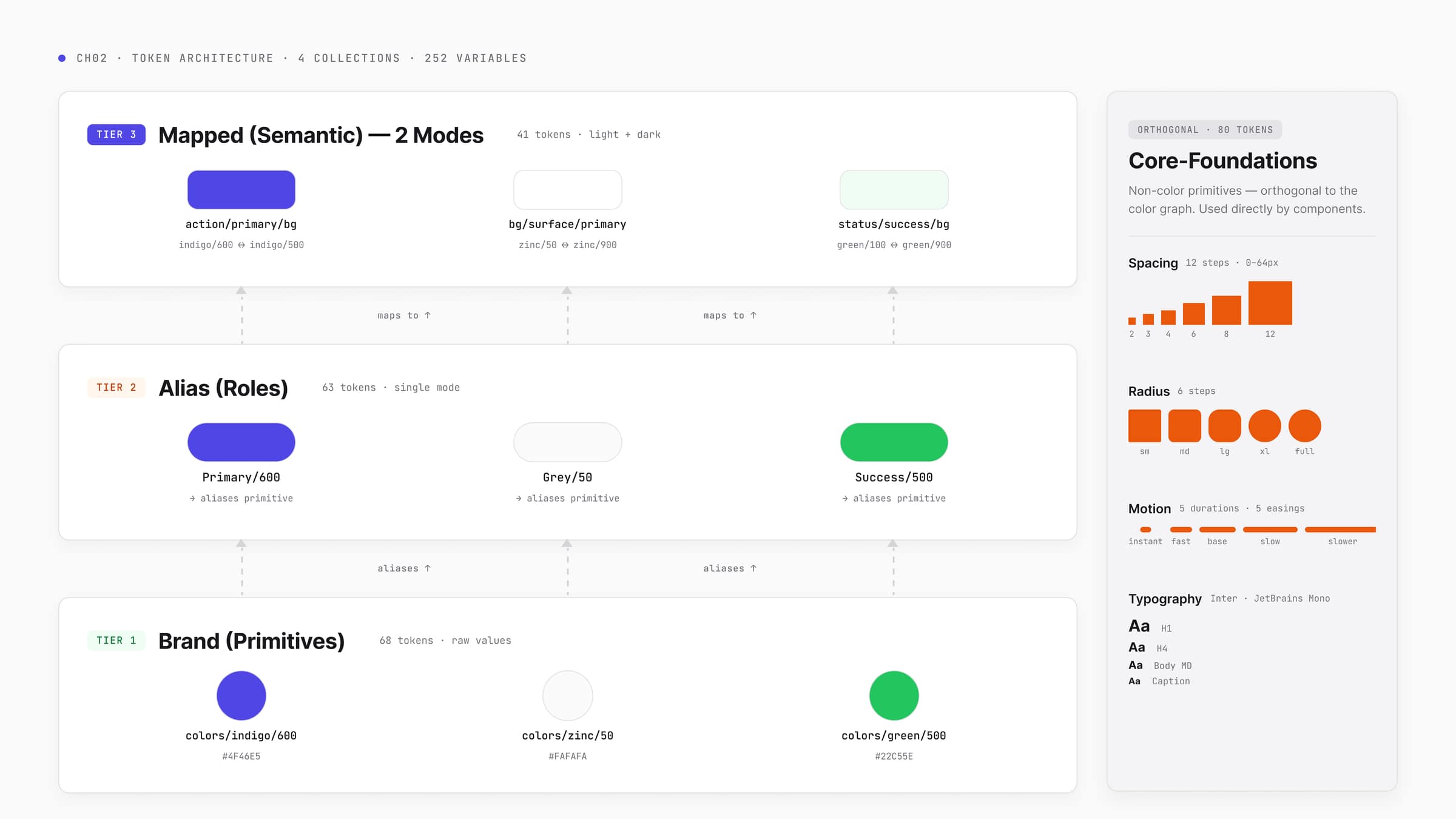
Primitives → Aliases → Mapped Semantic, three tiers wired through one diagram, with Core-Foundations (spacing, radius, motion, type) sitting outside the color graph.
rev 03decision
Scoping the variables.
❝I split the system into four collections. Brand, Alias, Mapped, Core-Foundations.
A spacing change does not touch colour. A colour change does not touch radius.
Then I scoped the variables themselves. In Figma, a designer reaching for a frame fill sees 4 background tokens. The other 248 are hidden.
Guardrails beat guidelines.
Pull-out · Decision
231
Scoped tokens
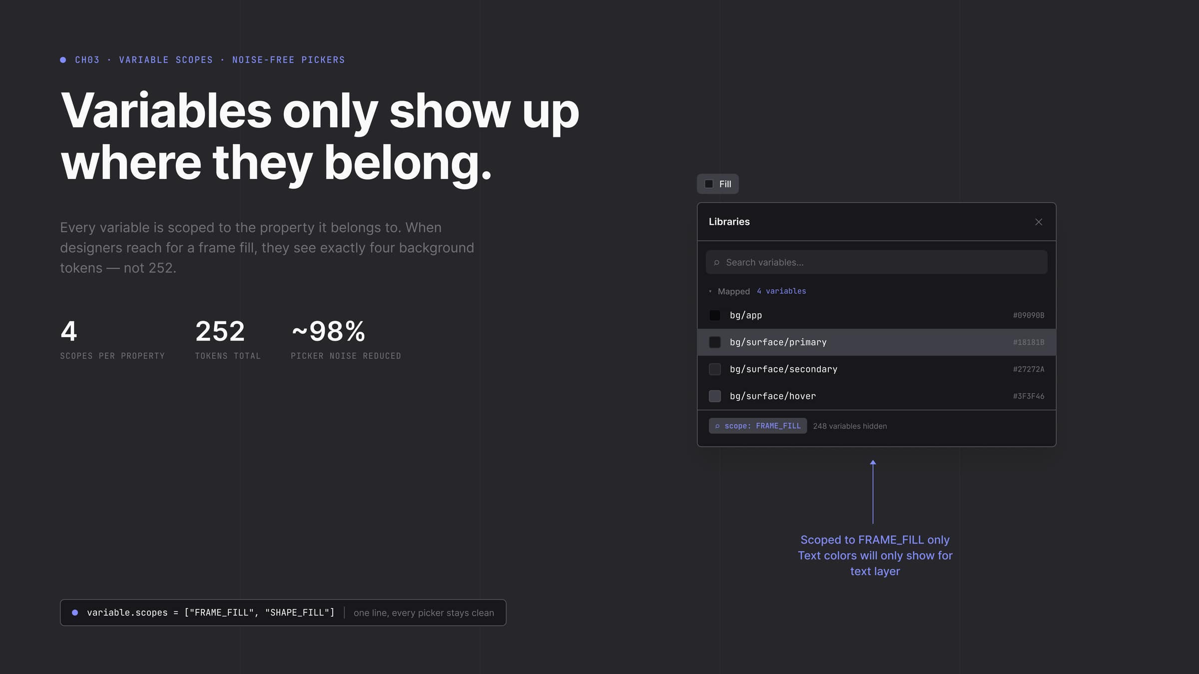
FRAME_FILL scope in action, when a designer reaches for a frame fill they see four background tokens; 248 irrelevant variables are hidden by design.
rev 04decision
The shortcuts I didn't take.
❝Same principle for a system as for a screen. Fewer decisions available to whoever touches it next.
| The shortcut | Why I did not take it | |
|---|---|---|
| One flat collection | A single token collection. Simpler to build, and what most systems ship. | A spacing change and a colour change then touch the same surface. Nobody makes either one confidently. |
| Two tiers | Primitive straight to semantic. The common pattern, and a week sooner to the dashboard. | It leaves Primary as a hex code with a nickname. The alias tier is what a rebrand actually reads. |
| Just the dashboard | Ship the modern dashboard the brief asked for. It looks finished on day one. | A dashboard with no foundation moves the decisions from now to later, one re-litigated hex at a time. |
Four collections cost more up front so that no future decision can bleed into one it should not.
rev 05build
47 components.
❝With the foundations locked, I built 47 components. Tables, cards, navigation, the full set.
The centrepiece was the button. A 60-variant matrix across size, intent and interactive state.
I built every state because the system would eventually need them. The dashboard never did.
An engineer working a Friday-night ticket should not have to guess what disabled outline danger small looks like.
Every component binds to semantic tokens. No raw hex anywhere. Dark mode was not a redesign, it was a token swap.
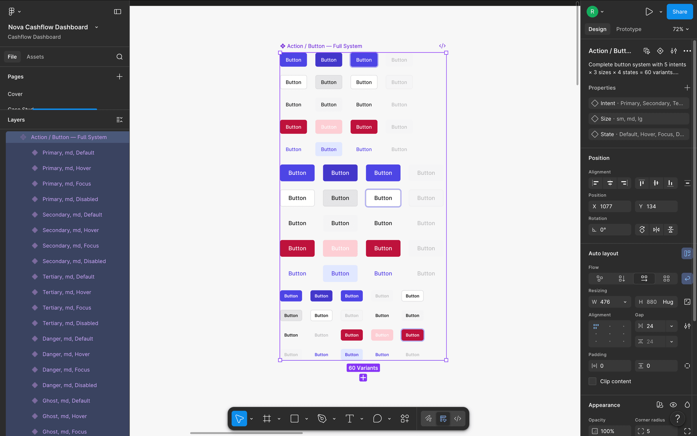
The 60-variant Action/Button component set in Figma, every intent × size × state pairing pre-rendered so an engineer on a Friday-night ticket never has to design a missing combination.
rev 06build
Figma to CSS.
❝The handoff was one document mapping every Figma token to its CSS variable.
Because there was no raw hex anywhere, the mapping was 1:1. `bg/surface/primary` in Figma became `var(--bg-surface-primary)` in CSS.
Contrast pairs were defined at the primitive level to meet WCAG 2.2 AA. Every component inherited that floor without being told about it.
Pull-out · Build
1:1
Figma to CSS parity

Foundations handoff page, palette, semantic scales, spacing, radii, typography, motion, density, breakpoints, accessibility, and a token naming rationale, all in one engineering-facing surface.
rev 07reflection
What I would do differently.
❝The decision I am proudest of was refusing to ship a surface redesign with no system under it. A pretty dashboard would have rotted in six months.
What I got wrong was motion. Motion and animation tokens should have gone into the foundations on day one. I treated them as a later sprint.
Next step is Code Connect, so the Figma components map straight to their React counterparts and the loop closes.
04. A 231-token, 47-component design system for an enterprise treasury dashboard. Self-initiated to explore what a fully tokenized system requires, Figma to CSS.
Want this kind of work on your team?