01BullpenA patented Silicon Valley sales platform2026
Shipped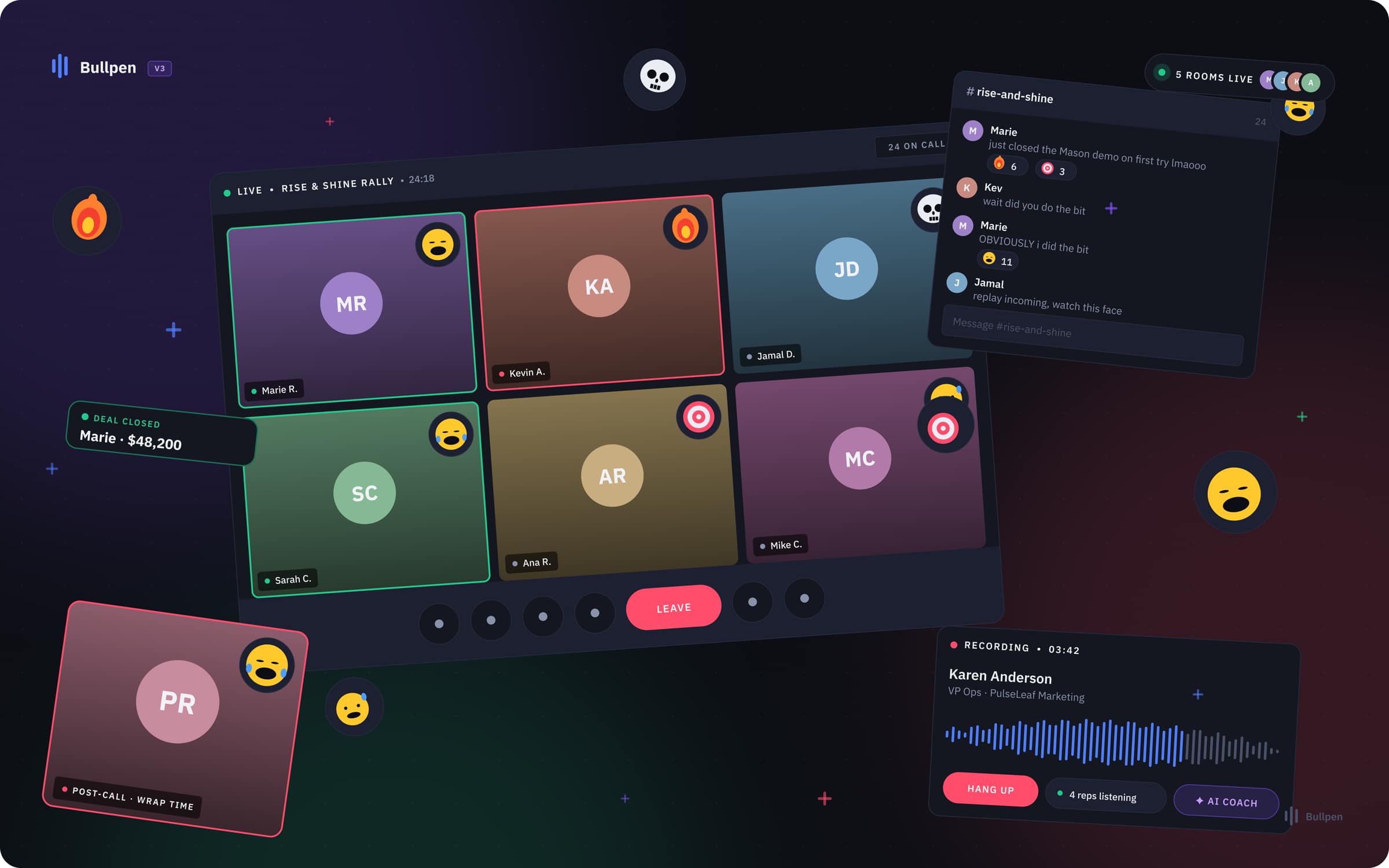
A team room for sales reps on live calls
On a platform with 100 million+ calls dialled. Failure states designed first, then rated A+ for ease of use by 15 sales reps.
Open case studyBindu Studio · Rahul Lokhande · India · Remote
Most products lose people on one or two screens. I find those screens and redesign them, in online stores, apps and business software, whatever the industry. Before I change anything, you and I pick one number to move: orders, signups, or how many people use a feature. 30 days after launch, I measure it again. Delivered as Figma, as working code, or both.

Fixing Product pages shoppers leave · Signups that stall · Setup nobody finishes · Features nobody finds · Checkouts that fail · Dashboards staff work around
Track record
Events, healthcare, sales and consulting so far. The job is the same in any industry: find the screen where people give up, and fix it.
Hyve
London events group behind Bett · reported $1.8B sale (2026)
Amaranth Insights
Healthcare AI for cancer care · Bangalore
A Silicon Valley sales platform
Patented · 100 million+ calls dialled
An AI pricing advisory
Founded by a former McKinsey strategy partner
Measured on my own work
Setup clicks for a sales team, before and after my redesign · Bullpen
Ease of use, rated by 15 sales reps before launch · top 4% of products tested
Audit fixes the founder shipped within 48 hours · RushURL
How results get measured
Every project starts with the number it is meant to move: orders, signups, finished setups, or people using a feature. You pick it. I write down where it stands today, and 30 days after launch you get both numbers, whichever way it went.
01 · Before
You share today's number. A screenshot from Shopify, Google Analytics or your own dashboard is enough.
02 · Launch
The redesign goes live. I note the date and anything else that changed that week.
03 · 30 days later
I measure the same number the same way and send you both, with what I think moved it.
Work with me · 4 ways
Fixed scope, fixed price, quoted before anything starts. Three things move a quote: how many screens are in scope, how much you have already decided, and whether you want the Figma, the code, or both. These rates go up as the studio's calendar fills.
015 working days
Start hereFind out which parts of one screen are losing you users, what each fix is worth, and what it takes to ship it.
023 to 4 weeks
One part of your product rebuilt so people can finish the job inside it, handed over in whatever form your team will actually use.
034 to 6 weeks
Stop three engineers building three different buttons. One system everyone builds from, in Figma, in code, or both.
04Ongoing
Design that keeps pace with your release cycle, for teams that need it every month and cannot hire for it yet.
Prices in USD. Indian teams are invoiced in INR at a local rate, just ask.
Selected work · 4 cases
A team room 15 sales reps rated A+ before launch, an audit a founder shipped in 48 hours, a fraud-check tool built end to end in two weeks, and a design system of 47 reusable parts. Every case names what was broken, what I built, and what it cost.
01BullpenA patented Silicon Valley sales platform2026
ShippedOn a platform with 100 million+ calls dialled. Failure states designed first, then rated A+ for ease of use by 15 sales reps.
Open case study02Project VerdictSelf-initiated · fintech2026
Method demo · working prototype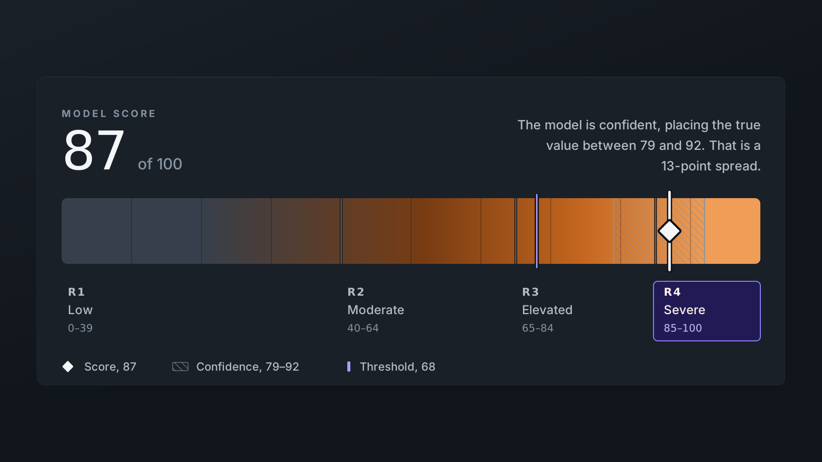
A fraud analyst at a card company gets 45 seconds to approve or decline a flagged payment. Project Verdict is a working demo of the screen they decide on.
Open case study03RushURL AuditRushURL · Dave Bissell, Founder2026
Shipped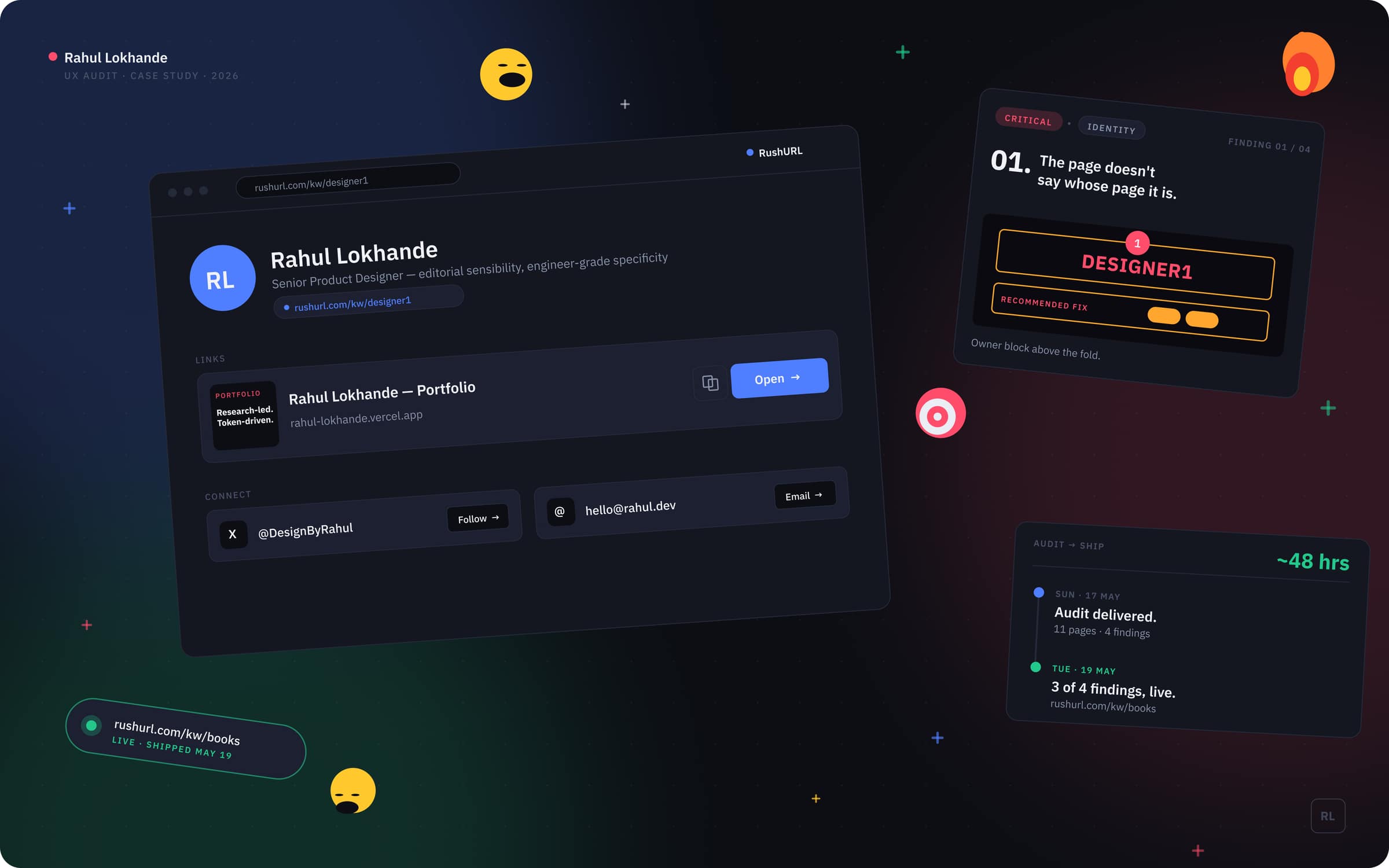
Four findings on a Sunday. The founder had three of them live by Tuesday.
Open case study04Project NovaSelf-initiated · sample finance product2026
Reference build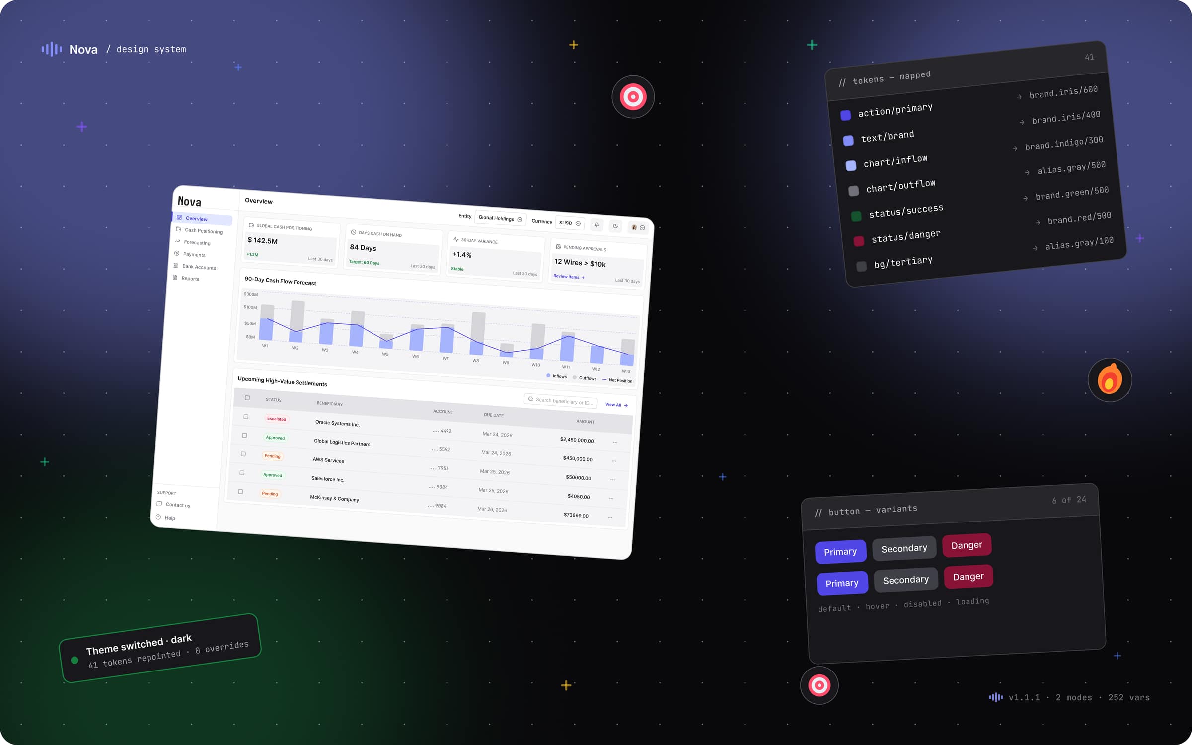
47 reusable parts for a finance product, identical in the design file and in the code.
Open case studyOther work · 3 cases
An AI helper for sales reps on live calls, the admin settings of a sales platform, and the AI workspace of an advisory founded by a former McKinsey partner. Same depth as the four above, listed here so the lead cases get read first.
Live transcript, mid-call answers and a one-click summary, for reps working 100 to 150 prospects a shift.
Sage AIShipped2026
142 settings regrouped into 8 tasks, where one wrong switch could quietly rewrite a customer's contract. Approved in 2024, then shelved.
Settings ConsoleDev-ready2026
Built for an advisory founded by a former McKinsey strategy partner. Two weeks, three designers, shipped.
ApertureShipped2025
Earlier work · 2 products
Designed at Coditas. The screens belong to the clients, so each one stays a single line here.
One portal for Spring Fair, Autumn Fair and Bett as they came back after COVID, each with its own process. Phone calls and paperwork became one self-serve flow. Today the three shows draw almost 90,000 visitors a year from 120+ countries.
HyveShipped · 2021 to 2022
For a Bangalore healthcare AI platform that analyses medical images and genetic data to improve cancer care.
Amaranth InsightsShipped · at Coditas
What a client said
I'd put off the RushURL redesign conversation for far too long. Rahul came back with a brief that cut straight to the four biggest issues, prioritized them clearly, and translated the fixes into a mock that felt native to my own brand. Every suggestion came with precise visual direction and an effort level my developer could act on immediately. Sharp creative judgment, backed by engineering-level detail, exactly the combination I needed.
How I work
Every screen-level decision should trace to a participant, a metric, or a principle. If it traces to none of those, it is an opinion, and opinions don’t survive a six-engineer team.