RushURL Audit
Shipped
An 11-page audit of a founder's keyword product. Four findings on Sunday. Three shipped by Tuesday.
Audit delivered Sunday 17 May 2026. Three of four findings shipped by Tuesday 19 May on a new keyword page at rushurl.com/kw/books, the founder's own implementation of the proposed redesign.
Client
RushURL · Dave Bissell, Founder
Brief from
Dave Bissell, Founder of RushURL
Team
Solo audit · Dave shipped the fixes
Users
Keyword-page owners and visitors · 2 live examples reviewed
Role
Sole designer · audit and redesign direction
Surface
Web · Keyword-to-links · Public page
Duration
2026 · 1 week
In short
- A paid audit of one live surface on a founder's product. Eleven pages, four findings, each ranked by impact and by the effort his developer would need.
- Delivered Sunday 17 May 2026. Three of the four were live in production by Tuesday 19 May, implemented by the founder himself.
- Heuristic and visual-hierarchy review against two live example pages. No user testing, so the evidence here is what he chose to ship, not a measured lift.
- This is the proof case for the $80 audit: what is in one, and how fast it moves.

What it moved
The numbers, in plain sight.
3 / 4
Findings shipped
~48 hrs
Delivery → first ship
0 → 3
Identity signals above the fold
2 → 0
Buttons competing for primary
The story · 7 chapters
How RushURL got built.
rev 00brief
How the audit started.
❝RushURL is an indie keyword-to-links product. Linktree, but you own the keyword instead of a profile slug.
Dave Bissell, the founder, built me a free /designer1 page as a gesture to a fellow designer. It was generous, and it was not earning the keyword.
I told him I had thoughts. He asked me to write them up.
The audit is 11 pages in my own brand. Cream paper, oil-black ink, crimson seasoning.
Cover, executive summary, four finding pages, quick wins, before and after, roadmap.
Built so a founder could read it on a Sunday and ship from it on a Monday.
Pull-out · Brief
11 pages
Audit document, founder-ready

Audit cover, eyebrow pill (RUSHURL · INDIE · SHARABLE KEYWORD-TO-LINKS), display headline, one-paragraph lede, and the auditor block at the foot.
rev 01investigation
What I audited.
❝The audit covered the public keyword page, the surface a visitor actually lands on.
RushURL has a multi-theme admin layer behind it. I did not have access to it and did not try to assess it.
I had two examples. /storm, Dave's own marketing page, and /designer1, the personal one he built me. Same public template, different themes.
Auditing both was the scoping decision. One page would have read as a one-off opinion.
Two pages on two themes showed which problems lived in the template and would ship once, and which lived in a palette and would need checking theme by theme.
The executive summary fit on one page. Three cards, three claims, no hedging. The point was to make the rest of the audit optional.
Pull-out · Investigation
2 themes
Audited to expose the template
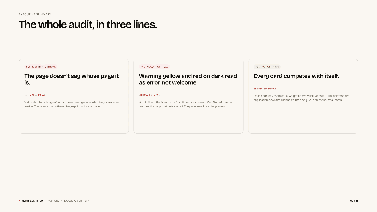
Executive summary, three TL;DR cards (F01 Identity · F02 Color · F03 Action), each with a severity pill, a one-line claim, and an Estimated Impact note.
rev 02insight
Four findings.
❝Every finding page had the same anatomy. A screenshot of the live product on the left, red numbered circles on the failures, a caption row naming each one.
On the right, three headings. What's Happening. Why It Matters. Recommended Fix. Effort and Confidence at the foot, for the engineer.
A severity pill sat next to a category pill on every header, so the founder could scan the document without reading it.
Pull-out · Insight
4 findings
Each with screenshot, callouts, fix
| What the page did | The fix | |
|---|---|---|
| F01 · Identity | No owner block. The owner's name sat mid-page with no face, and the social handle had no avatar. | Put the owner at the top. Three identity signals above the fold. |
| F02 · Colour | A red keyword title on near-black, with yellow card outlines and yellow buttons. It read as a warning. | Indigo primary, taken from the product's own Get Started button. Light mode by default. |
| F03 · Action | Open and Copy carried equal weight on every link card. Open is about 95% of intent. | Keep Open as the primary button. Demote Copy to an icon. |
| F04 · Hierarchy | The page opened with a four-line welcome paragraph. The title and link card sat below it, sometimes below the fold. | Link block first. Welcome paragraph after it. |
Three of the four live in the page template, so they ship once and apply everywhere. Colour depends on the theme.
I said which was which in every recommended-fix line. That is what decided the shipping order.
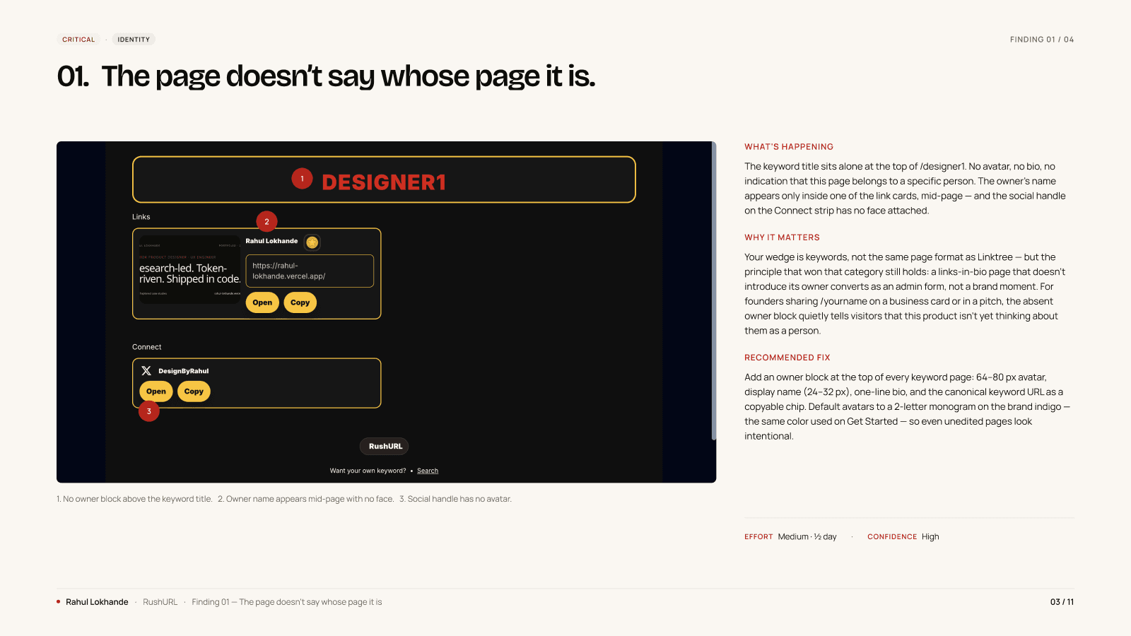
F01, Identity. Three numbered callouts point at the absent owner block, the mid-page owner name with no face, and the avatar-less social handle on the Connect strip.
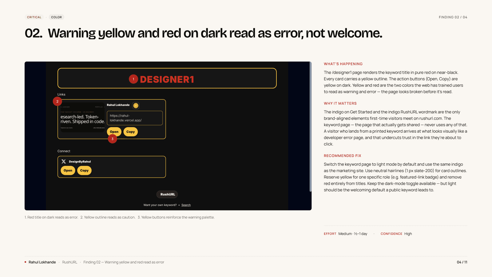
F02, Color. The keyword title rendered red on near-black, with yellow card outlines and yellow CTAs, a palette that reads as a warning state instead of a welcome.
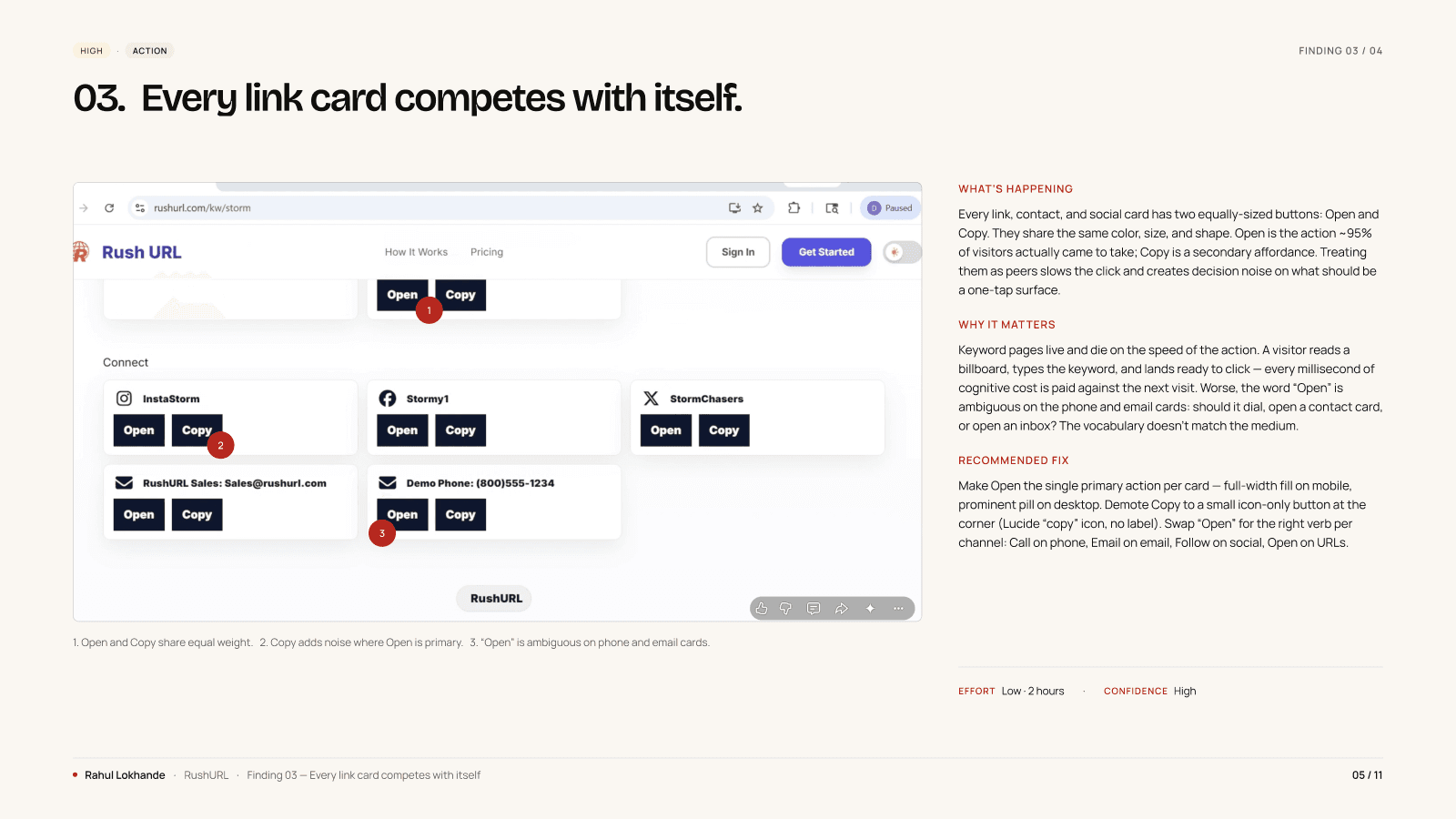
F03, Action. Open and Copy carry equal visual weight on every link card. Open is ~95% of intent; the duplication slows the click on phone and email rows.
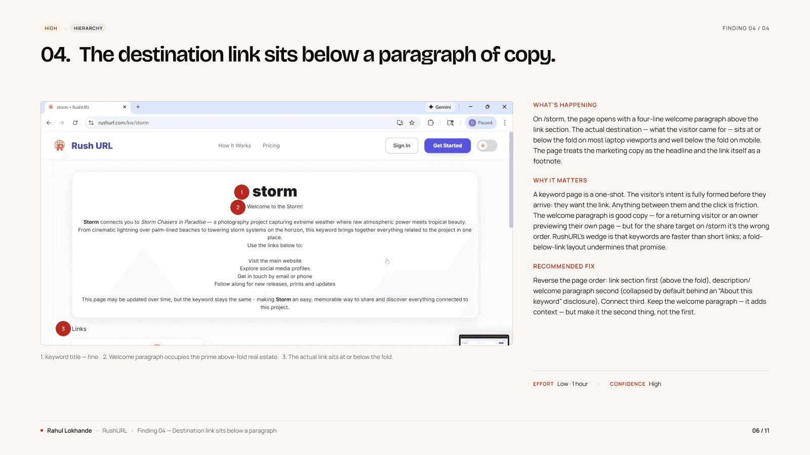
F04, Hierarchy. On /storm, the page opens with a four-line welcome paragraph. The keyword title and link card sit below it, sometimes below the fold on shorter viewports.
rev 03decision
Seven changes.
❝Audits die in the gap between the document and the engineer. I wrote the Quick Wins page so that gap was one afternoon.
Seven items. Each one names the finding it addresses.
Each carries an effort estimate in minutes, from 5 up to 60, assuming an engineer who knows the codebase. Total at the foot: 3 hours 35 minutes.
That page is why three findings shipped inside 48 hours. It replaced the question of what to do first with a checklist.
Pull-out · Decision
3h 35m
Total effort, every visible polish
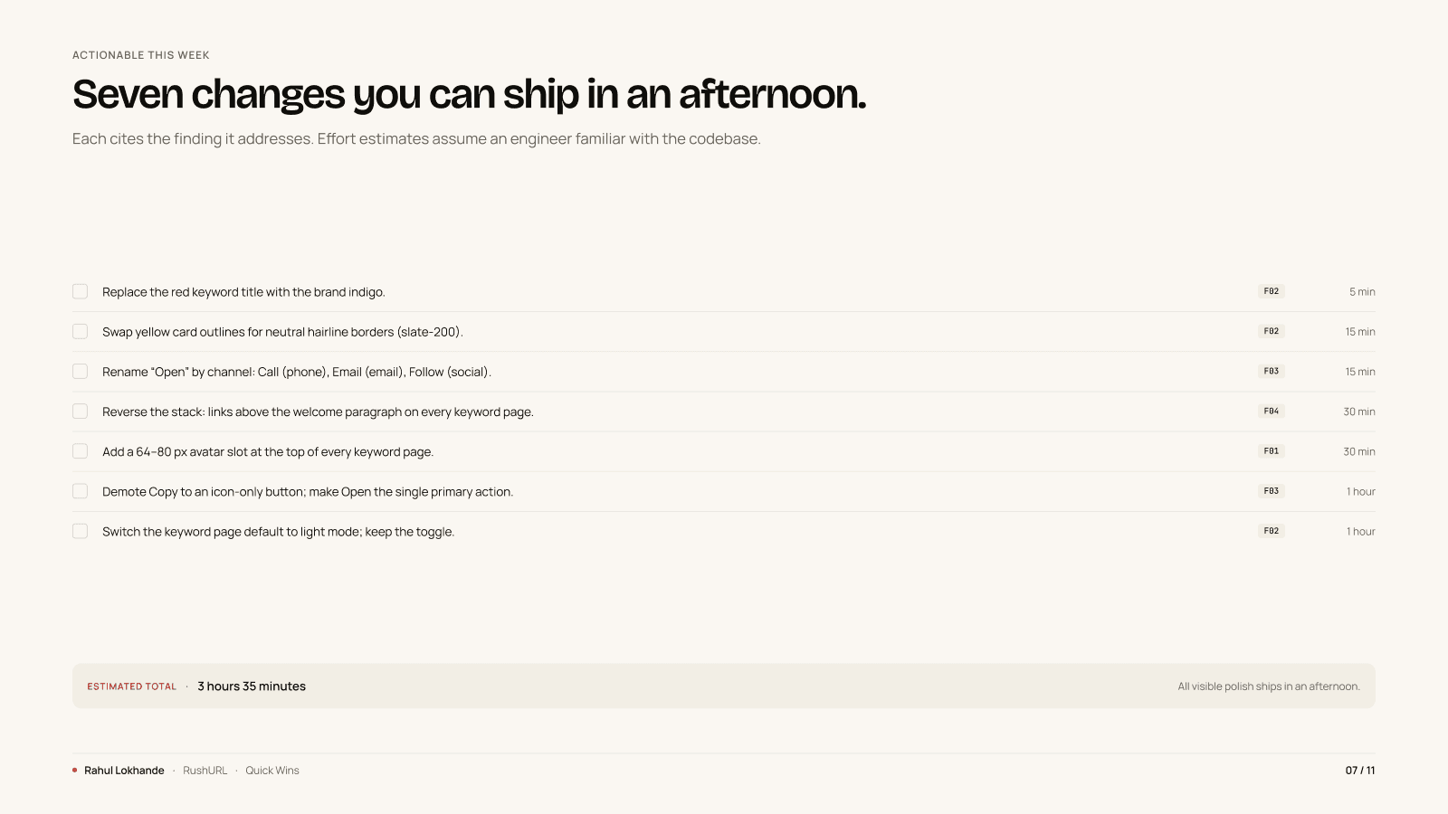
Quick Wins, seven checklist rows, each with a Find tag on the right (F01–F04) and a per-row effort estimate. Estimated total: 3 hours 35 minutes.
rev 04build
The redesign.
❝The redesign rebuilds one keyword page out of the brand the product already had.
Indigo as primary, because the product's Get Started button was already indigo. The keyword page had not got the memo.
Light mode by default, because warm content on a light surface reads as a shared link, not a system warning.
One mock, not a deck of variants. Founders ship from a single image that resolves several findings at once.
The mock carries the cross-reference inline, so the engineering call is one decision instead of four.
That is the artifact Dave built from two days later.
Pull-out · Build
F01–F04
Resolved by a single mock
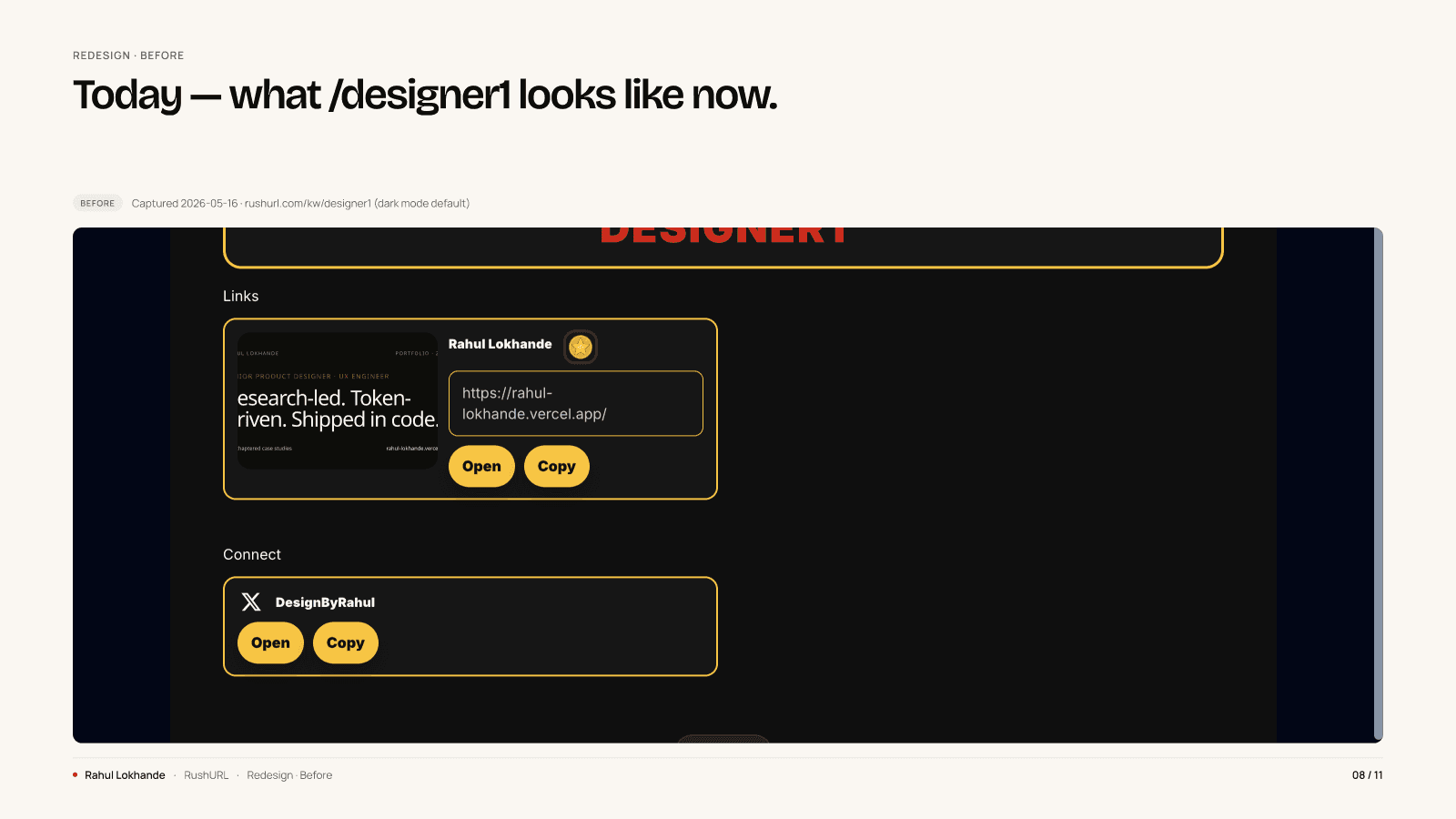
Before, what /designer1 looked like the day the audit was delivered. Captured 2026-05-16, dark mode default.
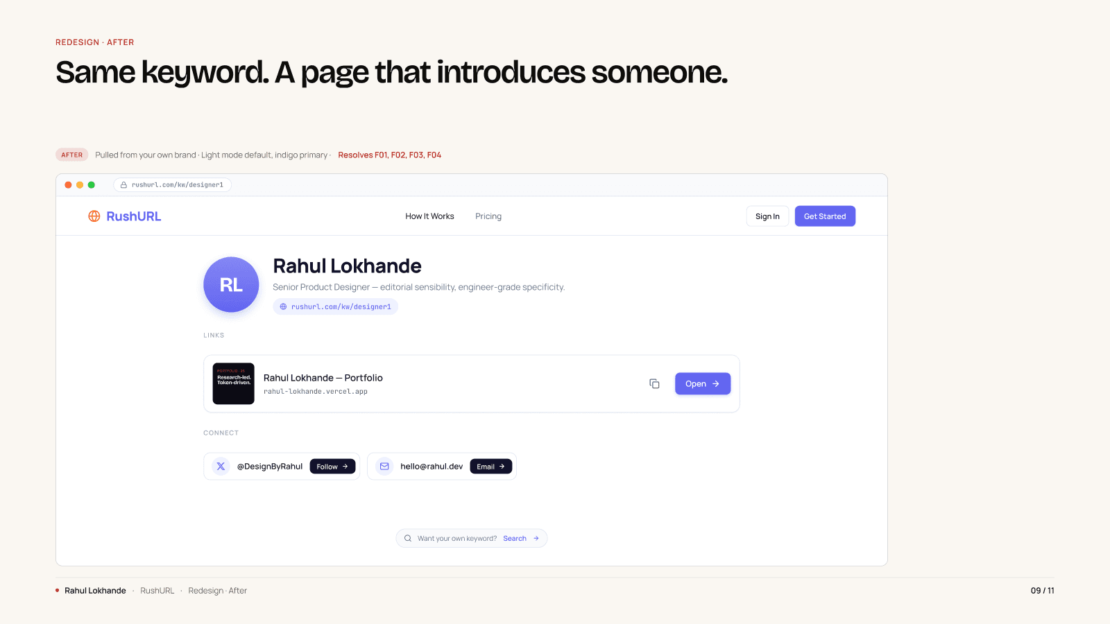
After, same keyword, a page that introduces someone. Pulled from the product's own brand: indigo primary, light mode default, owner block at the top, Copy demoted to icon.
rev 05outcome
What shipped.
❝I delivered the audit on Sunday 17 May. By Tuesday 19 May, Dave had shipped a new keyword page at rushurl.com/kw/books.
Three of the four findings, end to end. Forty-eight hours from PDF to production.
That is the working answer to the question every audit quietly fails. Will anything actually change?
The shipped page is brand-native, light-mode, and reads as a page belonging to a specific person.
The fourth shipped partly. F03 asked for Open to stay a primary button and only Copy to be demoted. The build demoted both.
Quieter, and the primary action is still not primary. It sits in the open threads.
Pull-out · Outcome
~48 hrs
Audit delivered → first ship
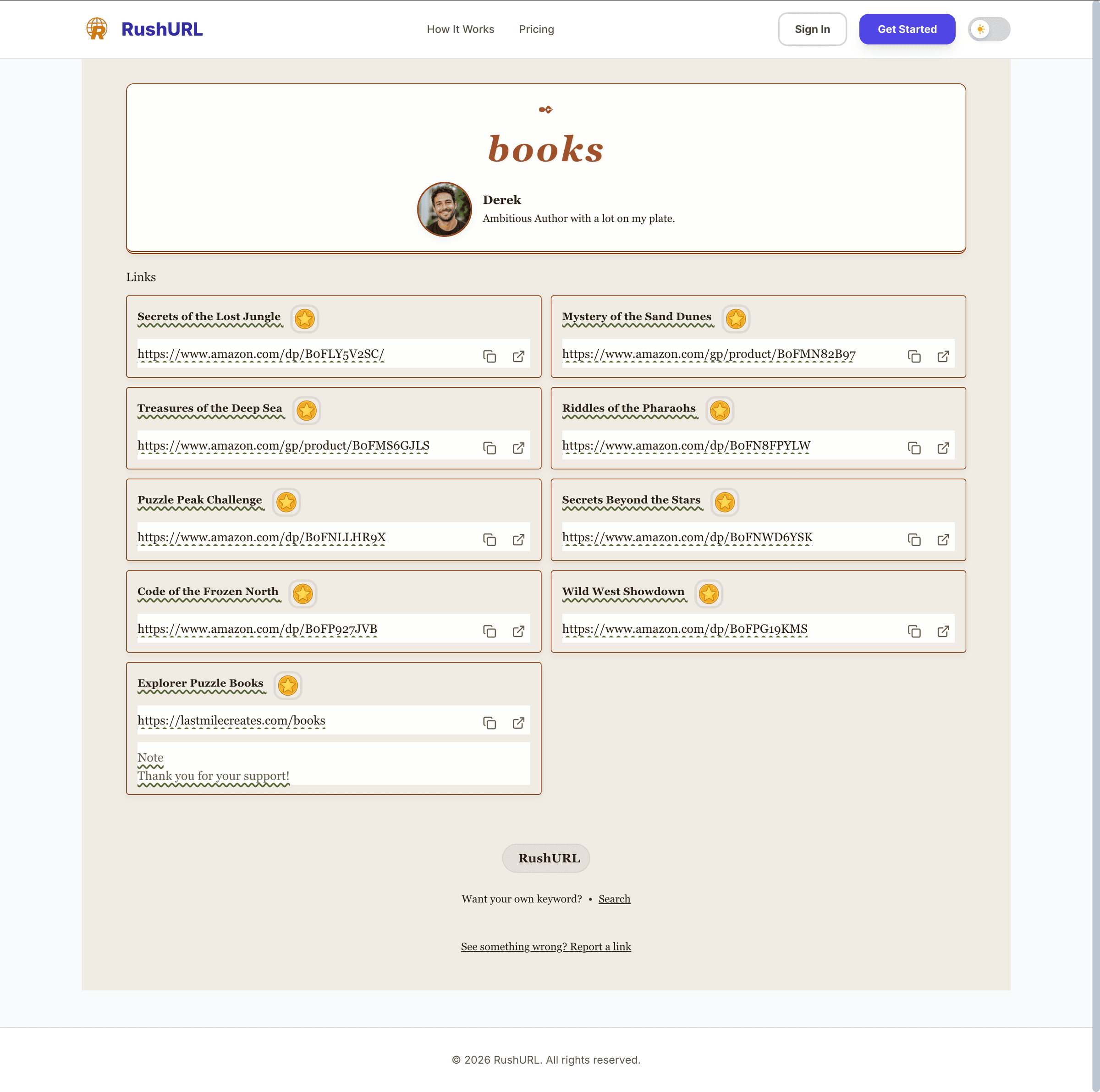
The shipped page, rushurl.com/kw/books, captured 2026-05-19. Identity above the fold, brand color on the title, link block above the welcome paragraph. Three of four findings, live in production.
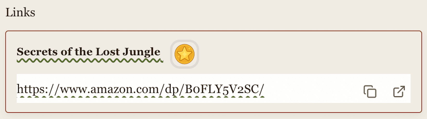
F03, partial, detail crop of the live link card. Both Open and Copy shipped as icon-only buttons, instead of Open remaining a primary CTA with Copy demoted. Counted as a partial ship in the open-threads list.
rev 06reflection
What the audit did not cover.
❝RushURL has a multi-theme admin layer I could not get into. The audit worked from the public keyword page and the two live themes I could see.
That scoping decided what travelled.
F01, F03 and F04 live in the page template. They ship once and apply everywhere.
F02 is per theme. Each of the 25 has its own palette, and a red title on a dark background can recreate the warning-colour problem on any of them.
The call worth making was not auditing the surface I could not see. It was naming which findings would travel and which would not.
Three open threads. Sweep the other 24 themes against F02. Get Open back as the primary button without bringing back the two-button competition. Build the analytics surface keyword owners still do not have.
Pull-out · Reflection
1 / 25
Public surface vs. themed library
03. Four findings on Sunday, three shipped by Tuesday, on a brand-native keyword page that finally puts the link first.
From the founder
❝I'd put off the RushURL redesign conversation for far too long. Rahul came back with a brief that cut straight to the four biggest issues, prioritized them clearly, and translated the fixes into a mock that felt native to my own brand. Every suggestion came with precise visual direction and an effort level my developer could act on immediately. Sharp creative judgment, backed by engineering-level detail, exactly the combination I needed.
Want this kind of work on your team?